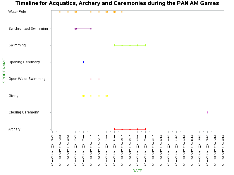
These Time Series Graphs give a visual picture of the Time Line of all the Sports at the PAN AM Games. The vertical y-axis shows the Sport Names while the horizontal x-axis shows the dates which run from July 6th 2015 to July 28th 2015.
These Time Series Graphs give a visual picture of the Time Line of all the Sports at the PAN AM Games. The vertical y-axis shows the Sport Names while the horizontal x-axis shows the dates which run from July 6th 2015 to July 28th 2015.
These Time Series Graphs give a visual picture of the Time Line of all the Sports at the PAN AM Games. The vertical y-axis shows the Sport Names while the horizontal x-axis shows the dates which run from July 6th 2015 to July 28th 2015.
 RSS Feed
