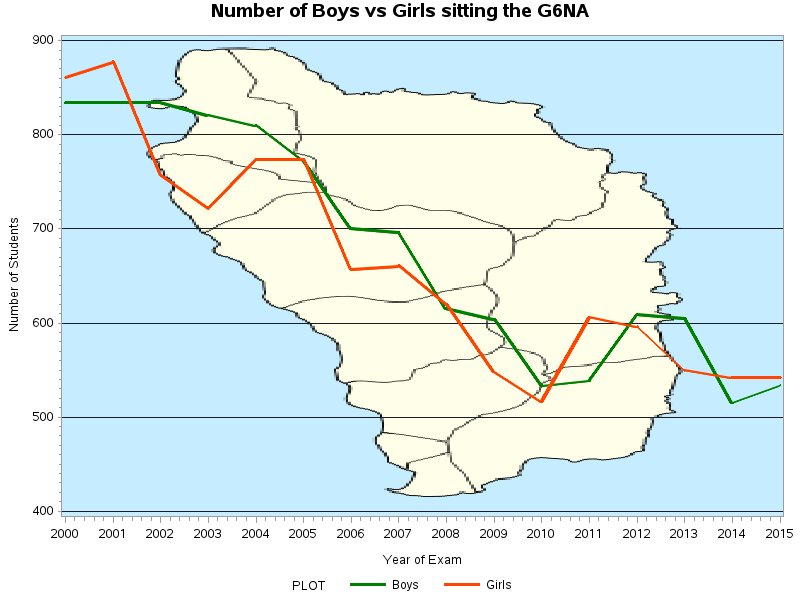
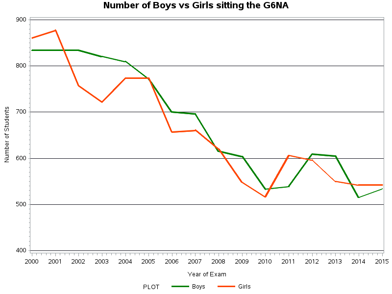
The following Time Series Plots show the changes in the number of boys and girls sitting the Grade Six National Assessment (G6NA) in Dominica from 2000 to 2015. The graph shows a definite decrease in the number of students over the years.
These graphs have been created using SAS Programs. The first graph has been kept simple. The green line represents the number of boys and the orange line represents the number of girls. The second graph is statistically identical to the first with the exception of the Map of Dominica in the background.
Further Statistical Analysis can be done to investigate and explain this gradual decrease over the years of the number of students sitting the G6NA.
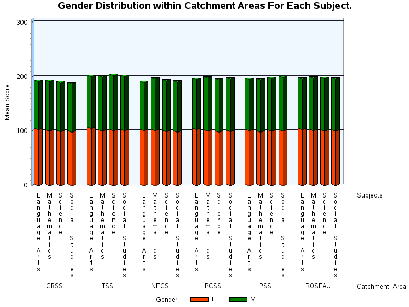
The following is a 3D Vertical Bar Chart that provides visual analysis of the G6NA in 2014. The graph separates the data into Catchment Areas and shows the mean scores of the students for each subject within each Catchment Area. It further breaks down the mean score into orange for females and green for males. To be more specific, it is able to look at the graph, focus on Roseau and look at the vertical bar for Language Arts. The vertical bar for Language Arts has an orange section that shows the mean score for girls in Roseau and a green section that shows the mean score for boys in Roseau.
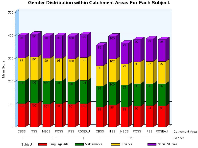
The following 3D Vertical Bar Chart is similar to the chart above with some slight differences. This chart, first separates the data into female on the left and male on the right. For both the female and male categories the chart shows the mean scores for Language Arts, Math, Science and Social Studies for each Catchment Area. For example, CBSS on the right shows the mean scores for females for each subject.


 RSS Feed
